Measuring CES: A Case-Study in People Measurement Analytics with Digital Mortar’s DM1
Measuring CES: A Case-Study in People Measurement Analytics with Digital Mortar’s DM1
By Gary Angel
|January 13, 2022
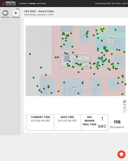
Digital Mortar was at CES 2022 with our LiDAR partner Quanergy. As part of the booth, we setup several of Quanergy’s LiDAR sensors in the booth, giving us people-measurement coverage of a decent chunk of the Smart Cities North Hall Area. During the show, we put a live feed of booth traffic from our real-time pipeline in DM1 onto Twitter and LinkedIn. But post-feed, we used DM1’s people-measurement analytics to do a quick analysis of traffic, performance, engagement and placement.
In this case-study, we’ll show how we did the analysis and show some of the results. It’s fascinating data – applicable to ANY convention presence (and any Conference) as well almost any people-measurement application including retail stores, malls, casinos, stadiums, airports, train-stations, resorts and even hospitals.
Download the PDF of the Case Study or Continue Reading…
Setting Up & Getting Data
There were some very significant limitations on setting up the sensors for people-measurement, First, all the sensors had to go inside the booth. That’s fine for measuring the Quanergy/Digital Mortar area, but it is far from ideal for measuring pass-by traffic and the larger smart cities area. Our sensor map is shown on the left, clustering all the sensors, but the configuration on the right would have been better:
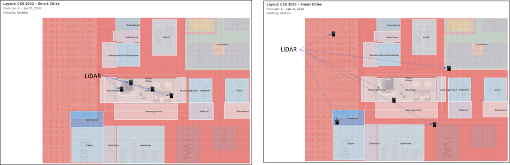
This also tends to bias the coverage since it gives us very dense coverage in some areas and along some lines of site but not in others. You might think this would mean we had much better coverage in our own booth and to some extent that’s true. However, LiDAR sensors aren’t like ceiling mounted cameras. They have a blind spot directly beneath them and given all the angles and booth stuff, we actually had better lines of site into some neighboring areas.
However, measurement was MORE than adequate and it’s important to call out how remarkable this is. The entire measurement system from installing sensors to full configuration of the platform including the digital map of the space was done in less than a day. That’s pretty incredible. What’s more, unlike measurement cameras, the sensors were mounted at all sorts of odd locations and differing heights, yet the system is still able to create a seamless, blended view of customers throughout the area. It’s a testament to the remarkable flexibility of LiDAR sensors and how far we’ve come with our DM1 integration.
And the data? In Digital Mortar’s DM1 we track the individual journeys of fully anonymized person objects and path their geolocation every 1/10th of a second then position them onto a map comprised of 1ft x 1ft grid points. It provides detailed views of how a space was used and how individual journeys played out.
The Questions
When you start an analysis, you should always have a specific set of questions in mind. You may well learn other things along the way but putting thought into the specific things you want to understand makes an analysis crisper and much more compelling. Here’s the questions we set out to answer:
- How good was our booth location compared to nearby booths?
- How engaging was our booth compared to other booths?
- How engaging was the booth to pass-by traffic?
- How engaging were we when people came into the booth?
- Was the booth oriented correctly and did we take full advantage of our traffic
- What part of our booth was most engaging?
- When were we busiest/least busy?
- What route did people follow inside the booth?
- What else in Smart Cities were Quanergy visitors most interested in in?
Booths at shows like CES are a big investment. The space is expensive. The booth setup is expensive. Flying a large team there and having them stay is expensive. And, of course, all the otherwise lost hours of work are expensive. You can and should measure lead and deal flow – but that won’t tell you anything about what you got right or wrong – it will just give you an overall success metric. With people-measurement, you can learn how to do better – which, when you get right down to it, is probably more important.
Question #1: How Good Was Our Location?
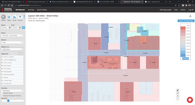
To understand the quality of our location, we used one of the most powerful features of our DM1 platform – the ability to create multiple digital maps of a space and use them for analysis. We started with this basic space map where we mapped the booths in our area:
To this, we added facings that marked out the primary orientation of each booth. These facings area allow us to measure the traffic along the main face of each booth and compare raw traffic. That’s one measure of how good the location is.
Finally, we created a completely different map that measured entire vertical and horizontal hallways. This is the kind of mapping you might use from a broader convention perspective:
Let’s take a look at the basic facings data. There were six different booths (we’ve changed the names of all the booths except ours) where we had good measurement. Here are the relative traffic counts for the primary facing of each:
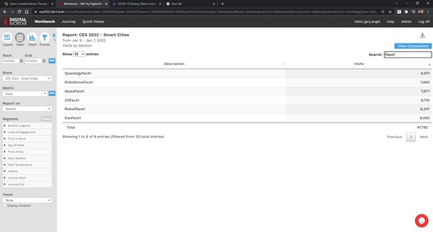
The Quanergy facing had the most traffic. Of course, the Quanergy facing is also the largest of the booths we measured. On a per square foot basis, Glass had the best traffic per square foot of facing. Without going into dollars, it’s impossible to know what the highest-ROI location was, but with a traffic map like this and booth space pricing, it would be quite easy to figure that out.
Question #2: How engaging was our booth compared to other booths
Part 1: Did we engage pass-by traffic
With this question, the focus is on whether the booth’s content is appealing to CES attendees. What we’re looking for is the percentage of pass-by attendees who engaged with the booth’s contents. This one is really easy to answer in DM1. In creating the digital map, we created pass-by zones in front of each booth. DM1 has two built-in metrics of engagement – Lingers and Considers. Each is a configurable time-based threshold. We configured Lingers to be 60 seconds and Considers to be 180 seconds. Then we just ran a simple report looking at those two measures of engagement in the pass-by area:
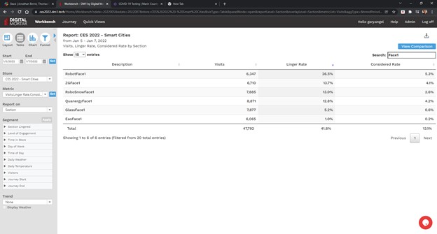
Our booth was pretty much in the middle in terms of basic (60 second) pass-by engagement. The Robot booth was way better than everyone else. ZG, RoboSnow and Quanergy were all pretty similar. Glass and Eao were significantly worse. The Quanergy booth had the second highest consideration rate (after Robot – which still won but by much less. Quanergy was just slightly better than ZG in deep engagement in the pass-by area. The Eao booth was by far the worst performer on both measures, but that’s somewhat misleading. Their booth was really setup so that all the interesting stuff required you to go in. That’s reflected in how poor the pass-by area did.
Part 2: How engaged were people in the booth?
You can see how important it is to understand booth structure when we answer Part #2 of this question – how engaged we’re people who came into the booth. To get that answer we ran the same report but just for the booths.
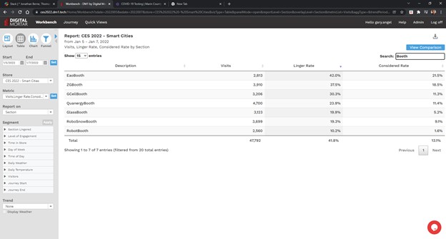
Obviously, the RobotBooth was really setup to engage pass-by traffic not bring traffic into the booth and the Eao booth which did so poorly in the pass-by was quite good at in-booth engagement. Our booth had solid in booth engagement (and the most in-booth visits), but ZG did really well. With great pass-by and in-booth engagement, they were both a great fit for CES and obviously did a really nice job.
It’s important to understand that companies have different goals in mind at a show like CES. RobotBooth might be primarily interested in branding and attracting crowds and media interest – so great pass-by engagement and limited in-booth engagement might be ideal. Eao was probably just the opposite. For our Quanergy booth, both goals were important with a little more emphasis on in-booth engagement. Our takeaway was that we did fairly well but could probably improve in both areas.
Question #3: Was the booth oriented correctly and did we take full advantage of our traffic
This first couple questions are primarily contextual – they give a sense of how good the position of the booth was and how well it took advantage of that position. These next set of questions are really designed to get at what worked best in the specific booth setup and here we only analyzed our own booth. To answer this question about booth orientation, we created Faces for three sides of the booth and then ran numbers for each face.
The primary booth orientation was forward to Face1. Face 2 had a coffee station but no other display. Face3 opened on to part of the mobility display.
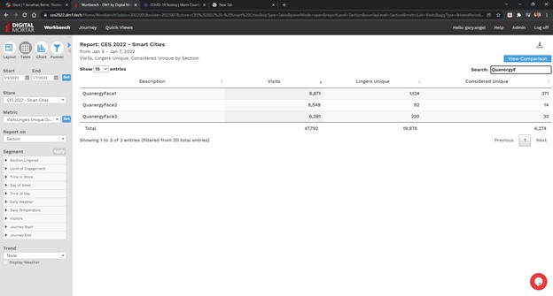
The results are stark. Nearly all of our pass-by enagement came from the forward orientation. That makes perfect sense since that’s the way the booth was oriented, but while Face1 did have the most traffic, there was a LOT of traffic along each of the other 2 Faces. Our question after running this was whether much if any of this traffic was unique. In other words, if everybody who touched Face2 or Face3 also went into Face1 then we weren’t really losing any engagement opportunities.
To figure that out, we used DM1’s journey segmentation to isolate the population that touched one or more of the Quanergy Faces for at least five seconds. Then we reran the report to see the overlap between sections.
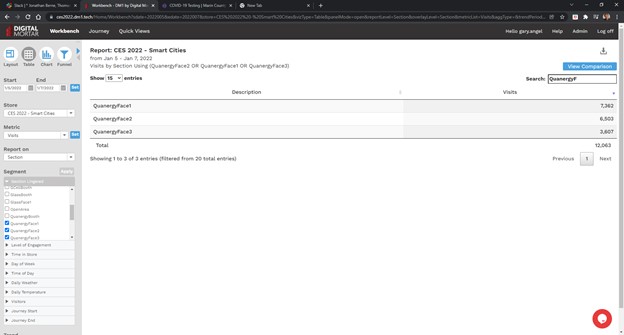
Now, the total number of visits that touched one of our faces was 12,063. Of those, 7,362 touched the primary face – Face1. That means 4,701 visits touched Face2 or Face3 without touching our main engagement area – Face1. That’s almost 40% of visits. This indicates we should probably put at least some engaging elements on the non-primary faces to maximize our booth opportunity.
Question #4: What Part of the booth was most engaging?
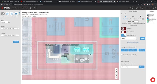
Our booth contained a mix of elements and was designed to engage pass-by traffic but also facilitate more in-depth conversations. To study that, we created a more detailed mapping of the sub-sections within the booth. Once again, this reveals the incredible power that comes from having the ability to on-the-fly map any part of the space and then get full-journey metrics about it. Here’s how we carved up the space in DM1’s digital mapping configurator tool. The main areas were the Coffee Bar, the Staff (Associate) area, the Smart City Area (where we were showing DM1), The Sensor Display and the Security area. We put the meeting rooms in but obviously we didn’t track inside those areas.
Defining an Associate area gave us an additional benefit. It classifies as Quanergy/DigitalMortar staff any person who went behind the front desk area. Since DM1 tracks full journeys, those people will also get eliminated in the counting and time measurements for the other areas. In analyzing booth performance that’s huge!
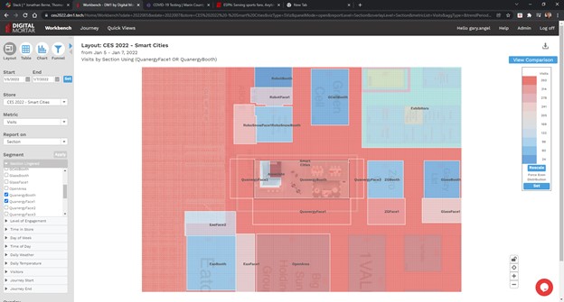
Here’s a raw visit (foot-fall) map of the booth area:
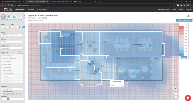
Now let’s look at the same map by time spent:
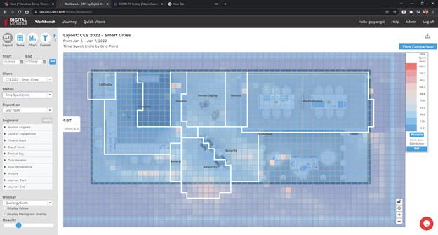
You can see the concentration of booth time in the Security and Smart City/DM1. What’s more, you can see that in the Smart City area it concentrated on the right-hand screen not the left-hand screen. The right-screen was showing the real-time view of people on the floor. The left-hand screen was running a looping video about measurement and smart cities. It’s pretty clear which was more engaging. Score one for real-time!
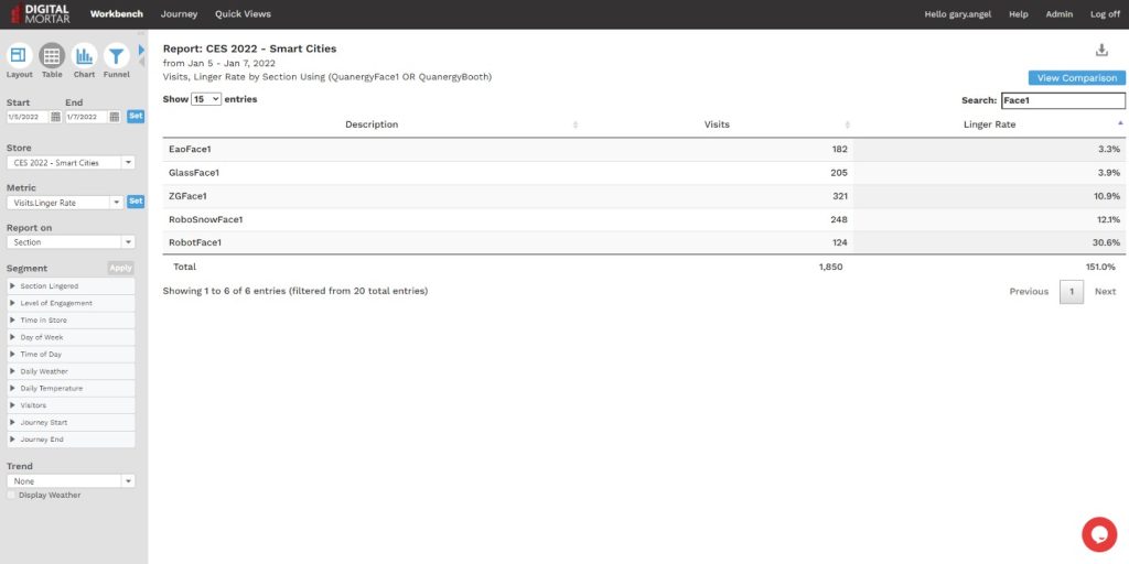
Here’s a more detailed breakdown of performance of the three major display areas in the booth:
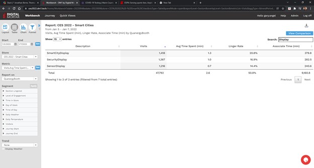
The traffic was pretty evenly distributed, but the SmartCity display had the highest engagement metrics and the Sensor Display had the lowest engagement rates.
Question #5: When were we Busiest/Least Busy
This is mostly interesting from a Staff perspective. You always want enough people working the booth, but if you know when the slow/busy periods are you can let booth staff do other work when it’s not necessary to have them around.
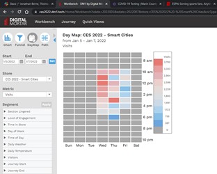
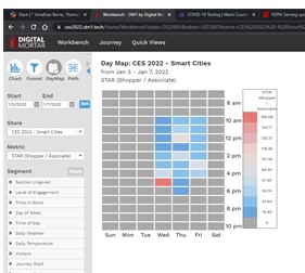
This one is also very easy to answer with DM1 – indeed, there are about five different ways to get at the answer. The easiest is probably the DayMap tool.
Here’s traffic by Hour and Day of show:
And here’s combined company staff:
You can see that a lot of us cut out by 2pm on Friday – and also that Friday was pretty light after 11am. In general, the staffing on Wednesday looks too heavy at the beginning and too light toward the end of the day. And it looks like there may have been a few periods on Thursday when the booth was very busy but not as heavily staffed.
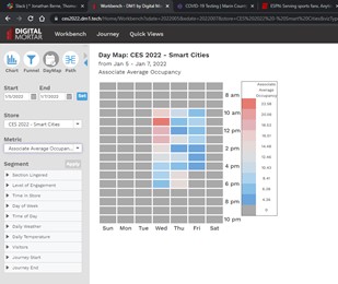
Putting this in terms of STARs (Shopper, in this case convention attendee vs. Associate) highlights the 3-4 trouble spots:
End of Day Wednesday, 12, and 2 on Thursday and 3pm on Friday all look like potential problem areas.
If the Show or Convention Center provided this kind of information up-front, it would be a lot easier to plan booth staffing.
Question #6: What Route did People Follow Inside the Booth
For this penultimate analysis we focused mainly on what got people into our Digital Mortar/Smart City display. To answer that question, we used DM1’s pathing tool:
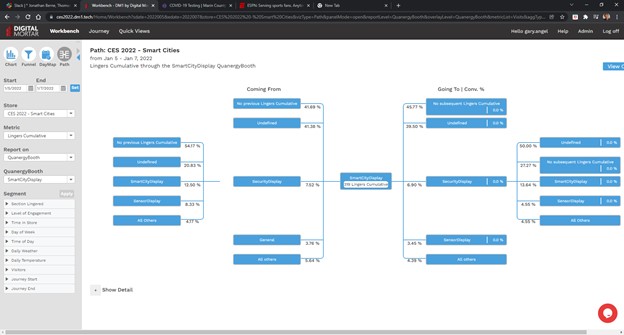
Undefined means they first visited our area from outside the booth (along the Face1 hall). About 50% of our visits were sourced that way. However, about 28% came through the middle of the booth and about 20% first went to the Security display and then went to Smart City. Note that Smart Cities gave just about exactly what it got. Almost identical percentages flowed from Smart Cities to those other areas.
If we flip the metric from visit to linger (so that we’re focused on only visitors who lingered in multiple areas), the picture is similar but it’s clear that engaged visitors were more likely to source from Security than Sensor or General and that once engaged in Smart City they were about as likely to go to Security and more likely to go to the Sensor Display than come from there.
It’s common to see a fair amount of back-and-forth in engaged visitors:
Whether it’s websites or floor plans, we find that people rarely navigate a space in a linear fashion.
Question #7: What else Interested Quanergy Visitors Most?
This was more of a curiosity question than a practical one and this analysis would be more pointed if we were measuring the entire space. But it’s always interesting to know what your engaged population was interested in. To get the answer, we simply segmented on engaged visits to the Quanergy booth and then looked at Lingers by Face and Booth elsewhere:
Here’s the numerical breakdown:
Our Quanergy visitors definitely liked the two Robot booths a lot! Given LiDARs potential in robotic navigation, that’s probably not too shocking.
Summary
Clearly, you can learn a LOT by actually measuring people movement at a booth. Our system was setup the day before and while it wasn’t optimized the way we would in a permanent smart city or retail deployment, it shows off the power of LiDAR and robust people-movement analytics. It also highlights how much there is to learn. Booths are expensive. How much has your company spent on show booths without ever being able to measure what was engaging, what worked and what didn’t? It’s the same in almost every people-measurement application.
Digital Mortar’s DM1 platform isn’t dedicated to convention floor measurement. It’s a powerful, generalized people-measurement tool that can handle almost any kind of problem. In this analysis we haven’t even looked at many of the tool’s most compelling use-cases – things like real-time, queue analytics, occupancy management, and merchandising experimentation. Yet with very little effort we were able to answer fundamental questions about booth placement, design, engagement and staffing.
Shouldn’t you be doing the same with all your real-world customer touch-points?
Download the PDF of the Case Study