People-Measurement Analytics: It all starts with heatmapping
People-Measurement Analytics: It all starts with heatmapping
By Gary Angel
|September 27, 2023
In our four-layer model of People-Measurement Platform functionality, reporting and analytics live at the very highest level, on top of the basic data processing, distribution and real-time layers.

It’s typically the biggest, most complicated and most variable layer of a People-Measurement Platform. What you get here will vary tremendously and what you NEED here may well vary a lot too. The key to thinking about the Reporting & Analytics layer in a People-Measurement Platform is to begin with how you expect to integrate people-measurement into your broader analytics and IT efforts.
If, like many enterprises, you already have a rich set of reporting and analytic tools, dashboards that are widely consumed, and a set of well-defined integration strategies, you will likely use a people-measurement’s reporting and analytics platform in very limited ways. If you don’t have any of that (or if you do, but choose not to use it), then you may be fully reliant on the reporting and analytics in the people-measurement tool to do everything for you.
It’s probably worth a quick note on why you might be reliant on a People-Measurement Platform for reporting or analytics even if you have all of the things outlined above; this usually happens in the context of a PoC. If you want to establish value in a tool before you do the work to integrate it, you need that tool to do a significant amount of reporting and analytics. That’s true even if, after full adoption, that becomes much less of a requirement.
In general, though, what you should expect out of the reporting and analytics in a People-Measurement Platform is bespoke tools that are highly optimized and appropriate to geo-location and journey data.
That begins with heat-mapping. A good heat-mapping implementation is the single most important bespoke tool in people-measurement.
You may be familiar with two common forms of heat-map – neither of which are good for people-measurement. In general purpose tools like Tableau, a heatmap is a kind of 2-dimensional bar-chart where the box size and color each represent a variable. Here’s a great example showing how this visualization can represent sales & profit in a compact and powerful way.

There’s nothing wrong with this viz and it can be usefully applied in people-measurement to certain kinds of variables. However, it isn’t in any way unique to geo-location or journey data and it doesn’t capture – in any way – the location aspect of people-measurement data.
A second type of heatmap is often used in, for example, digital analytics to understand mouse movements (or eye-tracking) on a site:

This is much closer to what you need for heat-mapping in people-measurement. A web site is, after all, a spatial entity. And it’s not unusual to see this kind of heat-mapping in people-measurement products.
That being said, it kind of sucks. If you’ve ever tried to use this kind of heatmap as an analyst, you probably know the problems. While it’s great eye-candy and it does effectively convey a story about where the user’s eye or mouse went, it is extremely difficult to use analytically. Suppose you take one of those middle areas in the 2nd column of the site above and changed the text. If you wanted to know if the changed text caused more people to eyeball the item, you’d have to visually compare a big square some of which is blue, some yellow and some orange. And those patterns will dance around over time. Some changes may be obvious (but not quantifiable) and many changes will simply defeat your eye/minds ability to make sense of them.
The same problem exists if you try to aggregate larger areas and compare them. In the image above, is the first or second column more viewed? The deep hot spot is clearly in the first column but the second column goes down 50% further. I’d guess the first column, but it’s easy to see that slightly different patterns might be totally ambiguous – even though the question CAN be directly answered from the data.
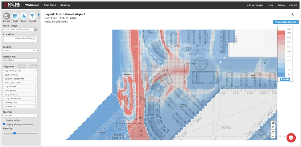
One of the best decisions I think I made way back in building our initial people-measurement platform was to abandon both these methods and build heat-maps on a board-game like grid system. Using a grid system has three huge advantages when it comes to people-measurement heatmapping. First, it captures the LOCATION aspect of the data. Data is displayed in a manner that maps directly to its spatial properties:

Second, by mapping grid-points (instead of, for example, the centimeters the data arrives in), we create a natural analytic unit. In the heatmap above, every grid point represents a square foot – and every metric, from foot-traffic to dwell-time to conversion, is available for that specific square foot. This solves the comparability problem. If you want to know whether an area changed, you can see it directly in the heatmap and get a specific and meaningful value for that particular square foot.

Finally, the grid point system allows for natural aggregation into larger spaces. In our DM1 platform, every square foot is mapped to some larger business area.
And those business areas can, in turn, be hierarchically aggregated into larger levels of analysis. And since these larger areas always map to a specific, logically defined area, every metric that can be generated at one level can be generated at every other level.

Best of all, this allows you to track metrics at the business logical level even when things get moved around. As long as the tool saves the mapping configuration for every data (see my post on mapping), then a heatmap can compare to stores over time even when every section in the store has been moved or changed in size!
Heatmapping is by far the most natural way to look at people-measurement data and it provides the inherent contextualization of a map of the space. Some of the extra features that go beyond analytics but that have proven useful over time include the ability to overlay an image of the space and draw logical boundaries on top of it (that may or may not correspond to the metric overlapy), zoom and pan in the space – particularly for very large locations, handle flooring, and control the scaling of the heatmap:

Not only is heatmapping uniquely suited to people-measurement data, this kind of heat-mapping is less naturally supported by general purpose tools – even ones with a focus on mapping (and mapping focus tools tend to be less common and less easy to use anyway). That makes it uniquely important in evaluating the capabilities of a People-Measurement Platform.