The Role of General Purpose BI & Data Viz Tools for In-Store Location Analytics and Shopper Measurement
The Role of General Purpose BI & Data Viz Tools for In-Store Location Analytics and Shopper Measurement
By Gary Angel
|February 21, 2018
One of the most important questions in analytics today is the role for bespoke measurement and analytics versus BI and data visualization tools. Bespoke measurement tools provide end-to-end measurement and analytics around a particular type of problem. Google Analytics, Adobe Analytics, our own DM1 platform are all examples of bespoke measurement solutions. Virtually every industry vertical has them. In health care, there are products like GSI Health and EQ Health that are focused on specific health-care problems. In hospitality, there are solutions like IDeaS and Kriya that focus on revenue management. At the same time, there are a range of powerful, general purpose tools like Tableau, Spotfire, Domo, and Qlik that can do a very broad range of dashboarding, reporting and analytic tasks (and do them very well indeed). It’s always fair game to ask when you’d use one or the other and whether or not a general purpose tool is all you need.
It’s a particularly important question when it comes to in-store location analytics. Digital analytics tools grew up in a market where data collection was largely closed and at a time when traditional BI and Data Viz tools had almost no ability to manage event-level data. So almost every enterprise adopted a digital analytics solution and then, as they found applications for more general-purpose tools, added them to the mix. With in-store tracking, many of the data collection platforms are open (thank god). So it’s possible to directly take data from them.
Particularly for sophisticated analytics teams that have been using tools like Tableau and Qlik for digital and consumer analytics, there is a sense that the combination of a general purpose data viz tool and a powerful statistical analysis tool like R is all they really need for almost any data set. And for the most part, the bespoke analytics solutions that have been available are shockingly limited – making the move to tools like Tableau an easy decision.
But our DM1 platform changes that equation. It doesn’t make it wrong. But I think it makes it only half-right. For any sophisticated analytics shop, using a general purpose data visualization tool and a powerful stats package is still de rigueur. For a variety of reasons, though, adding a bespoke analytics tool like DM1 also makes sense. Here’s why:
Why Users Level of Sophistication Matters
The main issue at stake is whether or not a problem set benefits from bespoke analytics (and, equally germane, whether bespoke tools actually deliver on that potential benefit). Most bespoke analytics tools deliver some combination of table reports and charting. In general, neither of these capabilities are delivered as well as general purpose tools do the job. Even very outstanding tools like Google Analytics don’t stack up to tools like Tableau when it comes to these basic data reporting and visualization tasks. On the other hand, bespoke tools sometimes make it easier to get that basic information – which is why they can be quite a bit better than general purpose tools for less sophisticated users. If you want simple reports that are pre-built and capture important business-specific metrics in ways that make sense right off the bat, then a bespoke tool will likely be better for you. For a reasonably sophisticated analytics team, though, that just doesn’t matter. They don’t need someone else to tell them what’s important. And they certainly don’t have a hard time building reports in tools like Tableau.
So if the only value-add from a bespoke tool is pre-built reports, it’s easy to make the decision. If you need that extra help figuring out what matters, go bespoke. If you don’t, go general purpose.
But that’s not always the only value in bespoke tools.
Why Some Problems Benefit from Bespoke
Every problem set has some unique aspects. But many, many data problems fit within a fairly straightforward set of techniques. Probably the most common are cube-based tabular reporting, time-trended data visualization, and geo-mapping. If your measurement problem is centered around either of the first two elements, then a general purpose tool is going to be hard to beat. They’ve optimized the heck out of this type of reporting and visualization. Geo-mapping is a little more complicated. General purpose tools do a very good job of basic and even moderately sophisticated geo-mapping problems. They are great for putting together basic geo-maps that show overlay data (things like displaying census or purchase data on top of DMAs or zip-codes). They can handle but work less well for tasks that involve more complicated geo-mapping functions like route or area-size optimization. For those kinds of tasks, you’d likely benefit from a dedicated geo-mapping solution.
When it comes to in-store tracking, there are 4 problems that I think derive considerable benefit from bespoke analytics. They are: data quality control, store layout visualization and associated digital planogram maintenance, path analysis, and funnel analysis. I’ll cover each to show what’s at stake and why a bespoke tool can add value.
Data Clean-up and Associate Identification
Raw data streams off store measurement feeds are messy! Well, that’s no surprise. Nearly all raw data feeds have significant clean-up challenges. I’m going to deal with electronic data here, but camera data has similar if slightly different challenges too. Data directly off an electronic feed typically has at least three significant challenges:
- Bad Frame Data
- Static Device Identification
- Associate Device Identification
There are two types of bad frame data: cases where the location is flawed and cases where you get a single measurement. In the first case, you have to decide whether to fix the frame or throw it away. In the second, you have to decide whether a single frame measurement is correct or not. Neither decision is trivial.
Static device identification presents it’s own challenge. It seems like it ought to be trivial. If you get a bunch of pings from the same location you throw it away. Sadly, static devices are never quite static. Blockage and measurement tend to produce some movement in the specific X/Y coordinates reported – so a static device isn’t remotely still. This is a case where our grid system helps tremendously. And we’ve developed algorithms that help us pick out, label and discard static devices.
Associate identification is the most fraught problem. Even if you issue employee devices and provide a table to track them, you’ll almost certainly find that many Associates carry additional devices (yes, even if it’s against policy). If you don’t think that’s true, you’re just not paying attention to the data! You need algorithms to identify devices as Associates and tag that device signature appropriately.
Now all of these problems can be handled in traditional ETL tools. But they are a pain in the ass to get right. And they aren’t problems that you’ll want to try to solve in the data viz solution. So you’re looking at real IT jobs based around some fairly heavy duty ETL. It’s a lot of work. Work that you have to custom pay for. Work that can easily go wrong. Work that you have to stay on top of or risk having garbage data drive bad analysis. In short, it’s one of those problems it’s better to have a vendor tackle.
Store Layout Visualization
The underlying data stream when it comes to in-store tracking is very basic. Each data record contains a timestamp, a device id, and X,Y,Z coordinates. That’s about it. To make this data interesting, you need to map the X,Y,Z coordinates to the store. To do that involves creating (or using) a digital planogram. If you have that, it’s not terribly difficult to load that data into a data viz tool and use it as the basis for aggregation. But it’s not a very flexible or adaptable solution. If you want to break out data differently than in those digital planograms, you’ll have to edit the database by hand. You’ll have to create time-based queries that use the right digital layouts (this is no picnic and will kill the performance of most data viz tools), and you’ll have to build meta-data tables by hand. This is not the kind of stuff that data visualization tools are good at, and trying to use them this way is going to be much harder – especially for a team where a reasonable, shareable workflow is critical.
Contrast that to doing the same tasks in DM1.
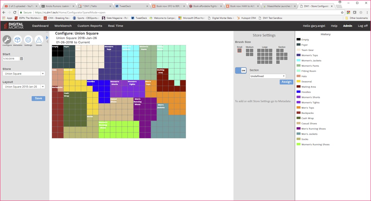 DM1 provides a full digital store planogram builder. It allows you create (or modify) digital planograms with a point and click interface. It tracks planograms historically and automatically uses the right one for any given date. It maintains all the meta-data around a digital planogram letting you easily map to multiple hierarchies or across multiple physical dimensions. And it allows you to seamlessly share everything you build.
 Once you’ve got those digital planograms, DM1’s reporting is tightly integrated. It’s just seamless to display metrics across every level of metadata right on the digital planogram. What’s more, our grid model makes the translation of individual measurement points into defined areas seamless and repeatable at even fine-grained levels of the store. If you’re relying on pre-built planograms, that’s just not available. And keep in mind that the underlying data is event-based. So if you want to know how many people spent more than a certain amount of time at a particular area of the store, you’ll have to pre-aggregate a bunch of data to use it effectively in a tool like Tableau. Not so in DM1 where every query runs against the event data and the mapping to the digital planogram and subsequent calculation of time spent is done on the fly, in-memory. It’s profoundly more flexible and much, much faster.
Path Analysis
Pathing is one of those tasks that’s very challenging for traditional BI tools. Digital analytics tools often distinguished themselves by their ability to do comprehensive pathing: both in terms of performance (you have to run a lot of detailed data) and visualization (it’s no picnic to visualize the myriad paths that represent real visitor behavior). Adobe Analytics, for example, sports a terrific pathing tool that makes it easy to visualize paths, filter and prune them, and even segment across them. Still, as nice as digital pathing is, a lot of advanced BI teams have found that it’s less useful than you might think. Websites tend to have very high cardinality (lots of pages). That makes for very complex pathing – with tens of thousands or even hundreds of thousands of slightly variant paths adding up to important behaviors. Based on that experience, when we first built DM1, we left pathing on the drawing board. But it turns out that pathing is more limited in a physical space and, because of that, actually more interesting. So our latest DM1 release includes a robust pathing tool based on the types of tools we were used to in digital.
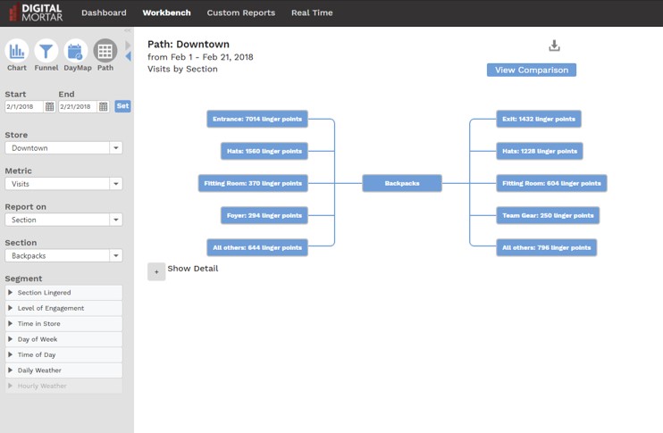
With the path analysis, you start from any place in the store and you can see how people got there and where they went next. Even better, you can keep extending that view by drilling down into subsequent nodes. You can measure simple footpath, or you can look at paths in terms of engagement spots (DM1 has two different metrics that represent increasing levels of engagement) and you can path at any level of the store: section, department, display…whatever.
And, just like the digital analytics tools, you can segment the paths as well. We even show which paths had the highest conversion percentages.
Sure, you could work some SQL wizardry and get at something like this in a general purpose Viz tool. But A) it would be hard. B) it would slow. And C), it wouldn’t look as good or work nearly as well for data exploration.
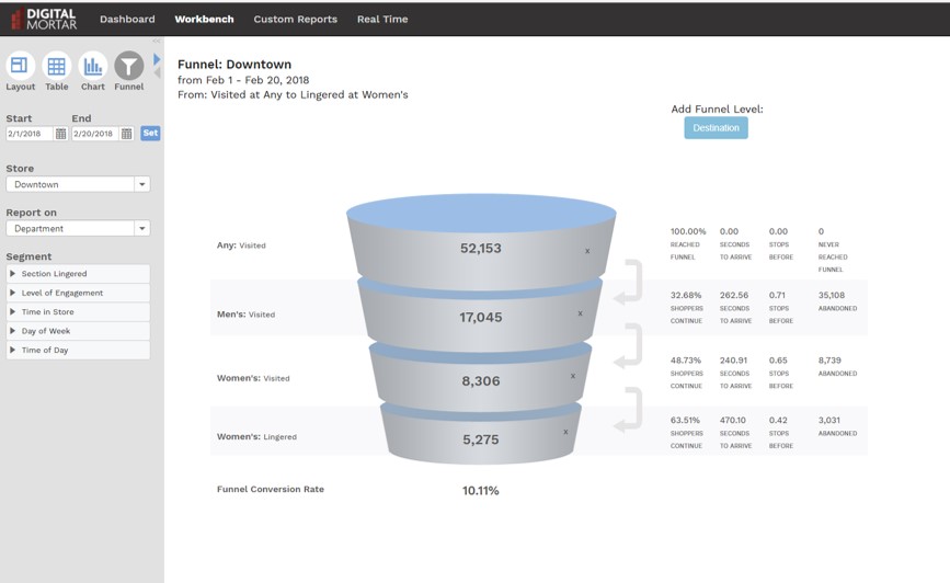
Funnel Analysis
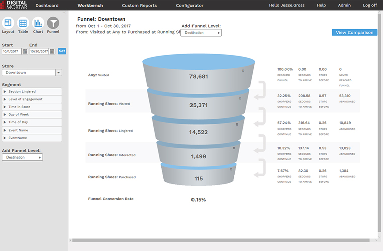
When I demo DM1, I always wrap-up by showing the funnel visualization. It shows off the platforms ability to do point to point to point analysis on a store and fill in key information along the way. Funnel analysis wraps up a bunch of stuff that’s hard in traditional BI. The visualization is non-standard. The metrics are challenging to calculate, the data is event-driven and can’t be aggregated into easy reporting structures, and effective usage requires the ability to map things like engagement time to any level of meta-data.
In the funnels here, you can see how we can effectively mix levels of engagement: how long people spent at a given meta-data defined area of the store, whether or not they had an interaction, whether they visited (for any amount of time) a totally different area of the store, and then what they purchased. The first funnel describes Section conversion efficiency. The second looks at the cross-over between Mens/Womens areas of the store.
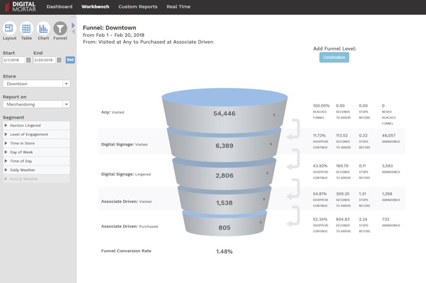
And the third traces the path of shoppers who interacted with Digital Signage. No coding necessary and only minutes to setup.
That’s powerful!
As with path analysis, an analyst can replicate this kind of data with some very complicated SQL or programmatic logic. But it’s damn hard and likely non-performance. It’s also error-prone and difficult to replicate. And, of course, you lose the easy maintainability that DM1’s digital planograms and meta-data provide. What might take days working in low-level tools takes just a few minutes with the Funnel tool in DM1.
Finally, Don’t Forget to Consider the Basic Economics
It usually costs more to get more. But there are times and situations where that’s not necessarily the case. I know of large-scale retailers who purchase in-store tracking data feeds. And the data feed is all they care about since they’re focused on using BI and stats tools. Oddly, though, they often end up paying more than if they purchased DM1 and took our data feed. Odd, because it’s not unusual for that data feed to be sourced by the exact same collection technology but re-sold by a company that’s tacking on a huge markup for the privilege of giving you unprocessed raw data. So the data is identical. Except even that’s not quite right. Because we’ve done a lot of work to clean-up that same data source and when we process it and generate our data feed, the data is cleaner. We throw out bad data points, analyze static and associate devices and separate them, map associate interactions, and map the data to digital planograms. Essentially all for free. And because DM1 doesn’t charge extra for the feed, it’s often cheaper to get DM1 AND feed than just somebody else’s feed. I know. It makes no sense. But it’s true. So even if you bought DM1 and never opened the platform, you’d be saving money and have better data. It would be a shame not to use the software but…it’s really stupid to pay more for demonstrably less of the same thing.
Bottom Line
I have a huge amount of respect for the quality and power of today’s general purpose data visualization tools. You can do almost anything with those tools. And no good analytics team should live without them. But as I once observed to a friend of mine who used Excel for word processing, just because you can do anything in Excel doesn’t mean you should do everything in Excel! In store analytics, there are real reasons why a bespoke analytics package will add value to your analytics toolkit. Will any bespoke solution replace those data viz tools? Nope. Frankly, we don’t want to do that.
I know that DM1’s charting and tabular reporting are no match for what you can do easily in those tools. That’s why DM1 comes complete with a baked-in, no extra charge data feed of the cleaned event-level data and a corresponding visitor-level CRM feed. We want you to use those tools. But as deep analytics practitioners who are fairly expert in those tools, we know there’s some things they don’t make as easy as we’d like. That’s what DM1 is designed to do. It’s been built with a strong eye on what an enterprise analyst (and team) needs that wouldn’t be delivered by an off-the-shelf BI or data viz tool.
We think that’s the right approach for anyone designing a bespoke analytics or reporting package these days. Knowing that we don’t need to replace a tool like Tableau makes it easier for us to concentrate on delivering features and functionality that make a difference.