The STARs Clock : Visualizing Shopper to Labor Ratios
The STARs Clock : Visualizing Shopper to Labor Ratios
By Gary Angel
|September 9, 2021
We’ve recently been using a data visualization focused on measuring the intra-day impact of shopper to labor ratios on conversion in the store that’s worth a look.
Why is STARS data important? It’s one of the best and most direct uses of shopper journey data- an intra-day STARs analysis can significantly improve labor models. Everybody knows overall store traffic and PoS, but without detailed traffic intra-day, it’s impossible to know if you have the right number of Associates working the floor. Too few Associates and your potentially leaving money on the table OR creating bad customer experiences. Too many Associates and your reducing margins. By combining Shopper Traffic and Associate presence by time of day, you get the intra-day STARs ratio. Take that ratio and compare it to conversion rates by area and you have powerful statistical measurement of whether you’re appropriately staffed at any given time for any given day of the week.
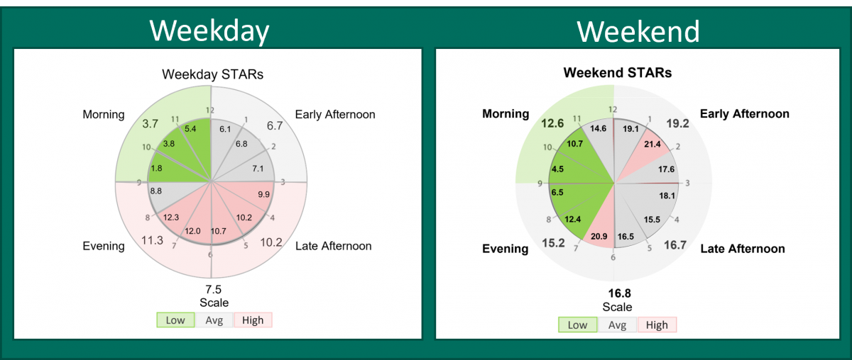
The visualization is called a STARS (that’s Shopper to Associate Ratio) Clock. It borrows a clock-metaphor to present inta-day STARs and conversion ratios by hour and shift in a clean, compact visualization.
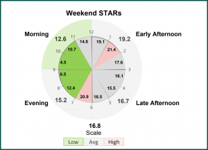
Each hour forms a slice extending from the center to the circumference. The inner clock face shows the STAR’s ratio for that hour – whether by Store or by Area within the Store. It’s color coded to show conversion rates. The outer clock face groups each hour into bigger wedges based on store shift times. So, for example, the morning shift is a wedge that might comprise 3-4 hours on the clock. It, too, shows the STARs for the Shift and the color-coded conversion rate.
The beauty of the STARs clock is that it packs a lot of Labor analysis into a very compact and familiar format. The clock face makes it easy to see how STAR’s rates evolved by hour. The consolidation of hours into shifts is visually natural and east to follow. And by coding conversion rates, it’s easy to track conversion rate vs STARs throughout the day.
It’s also a really nice tool for side-by-side comparisons between store areas, different stores or different day types. Here’s a comparison for a single store section between Weekend and Weekday:

Right now this is a viz we’ve been creating outside our DM1 platform using exported data. But we’re probably going to be including it as an alternative viz style to the traditional daymap viz. It’s not as good as a Daymap viz for a complete overview of Daytime parting, but it’s a more natural view for a single day especially when you want to combine both hour and shift-based views of the data.